Context
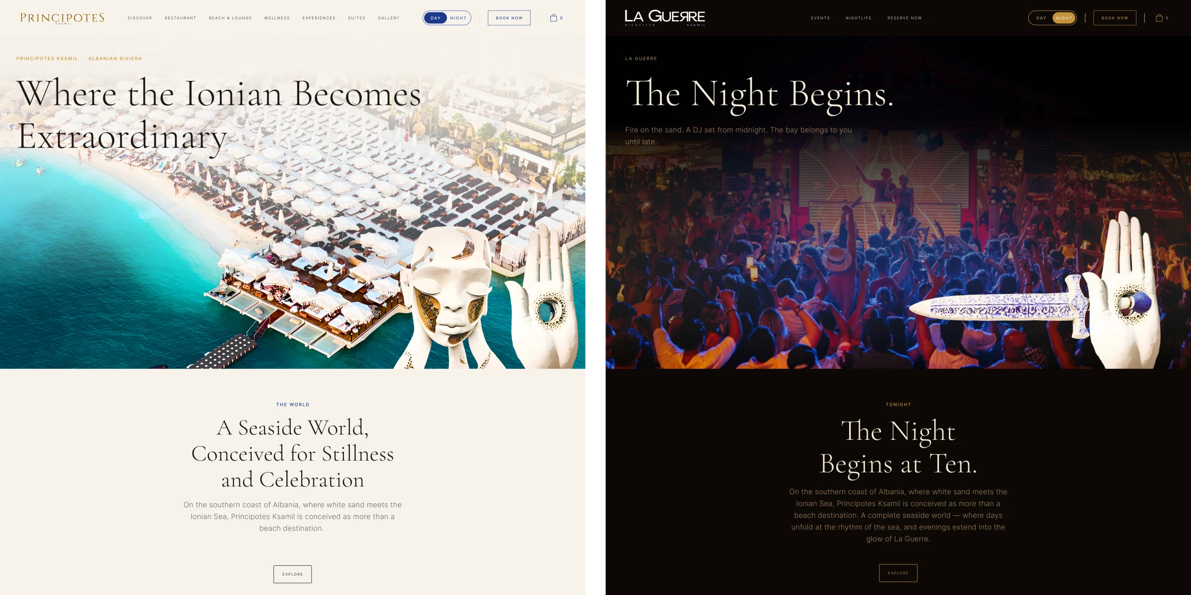
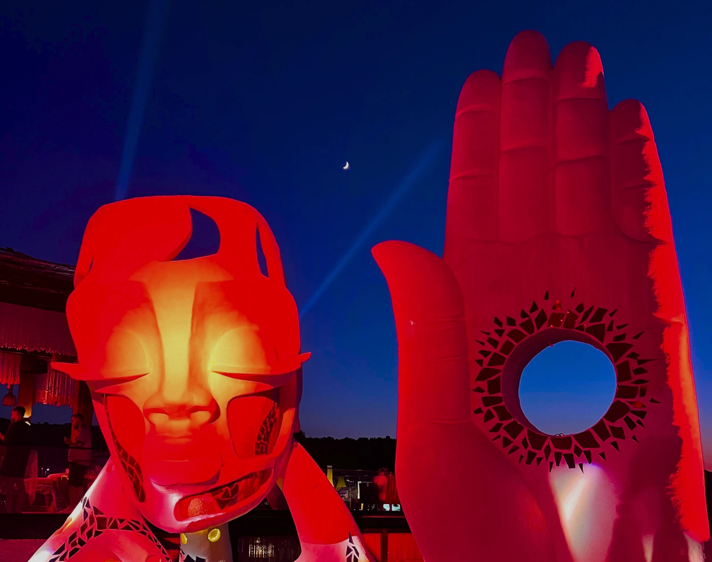
Principotes Ksamil is a luxury beach destination on Albania's Ionian coast, a new branch of the Principotes Group, whose flagship is Panormos Beach in Mykonos. The venue operates as two distinct brands sharing one physical space: Principotes by day (beach, wellness, restaurant, suites, experiences) and La Guerre by night (nightclub, VIP tables, DJ events, cocktail service).
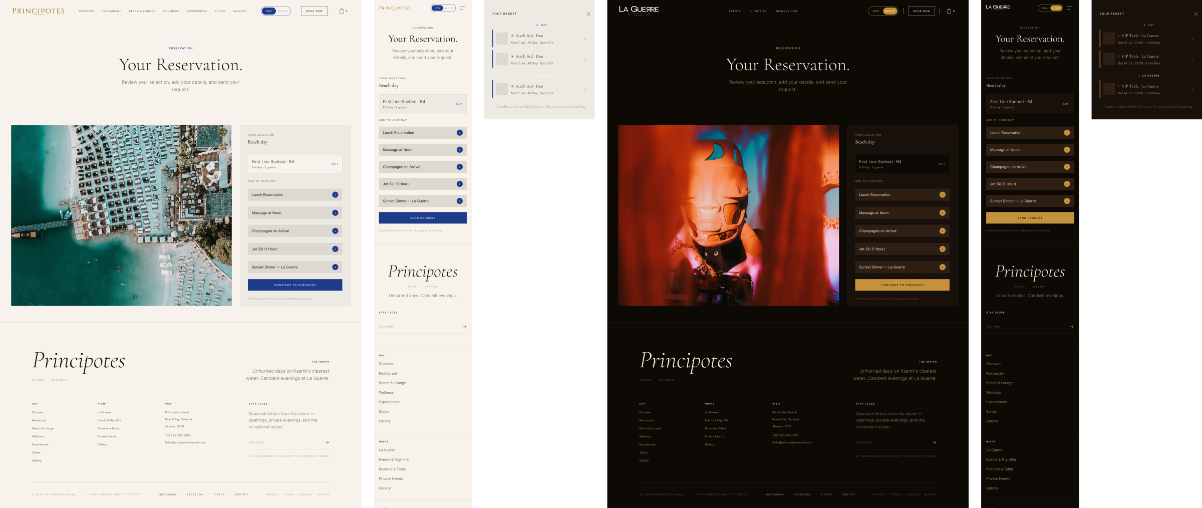
The product was a full digital presence: a website that expresses both identities through a single URL, switching between them via a Day/Night toggle that swaps the entire visual system at the CSS root level: tokens, copy, navigation, and content. No page reload, basket data preserved across modes.
I came in with no brief template, no existing brand, no design system, and no prior digital presence for this property. The scope grew progressively from there: what began as web design became a full product role encompassing branding, graphic design, 3D motion, design system architecture, master high-fidelity designs, developer handoff, and implementation oversight.
The scope
This was my first role as the sole lead designer on a product from inception to ship. The scope was significantly wider than the title suggests. In practice, it meant owning every layer of the product simultaneously:
Branding & visual identity
Two brand identities designed from zero: Principotes (refined bohemian luxury: warm, organic, editorial) and La Guerre (obsidian, gold, crimson: nightclub energy with haute-couture restraint). The day/night duality had to feel like two distinct worlds, not two colour schemes. Typography, motif systems, token architecture, and the Day/Night toggle interaction were all part of this layer.
Typography for both brands and the La Guerre concept: Anaïs Vincent.
Graphic design & print
Brand collateral designed in Figma: menus, event posters, in-venue signage, and print-ready assets aligned to both brand identities. This required working across the full graphic design stack: layout, motif systems (wave, meander, olive sprig, mosaic vine, azul flower), and print constraints, alongside the digital product work.
3D & motion
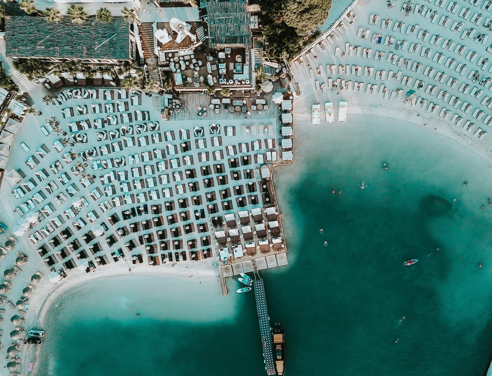
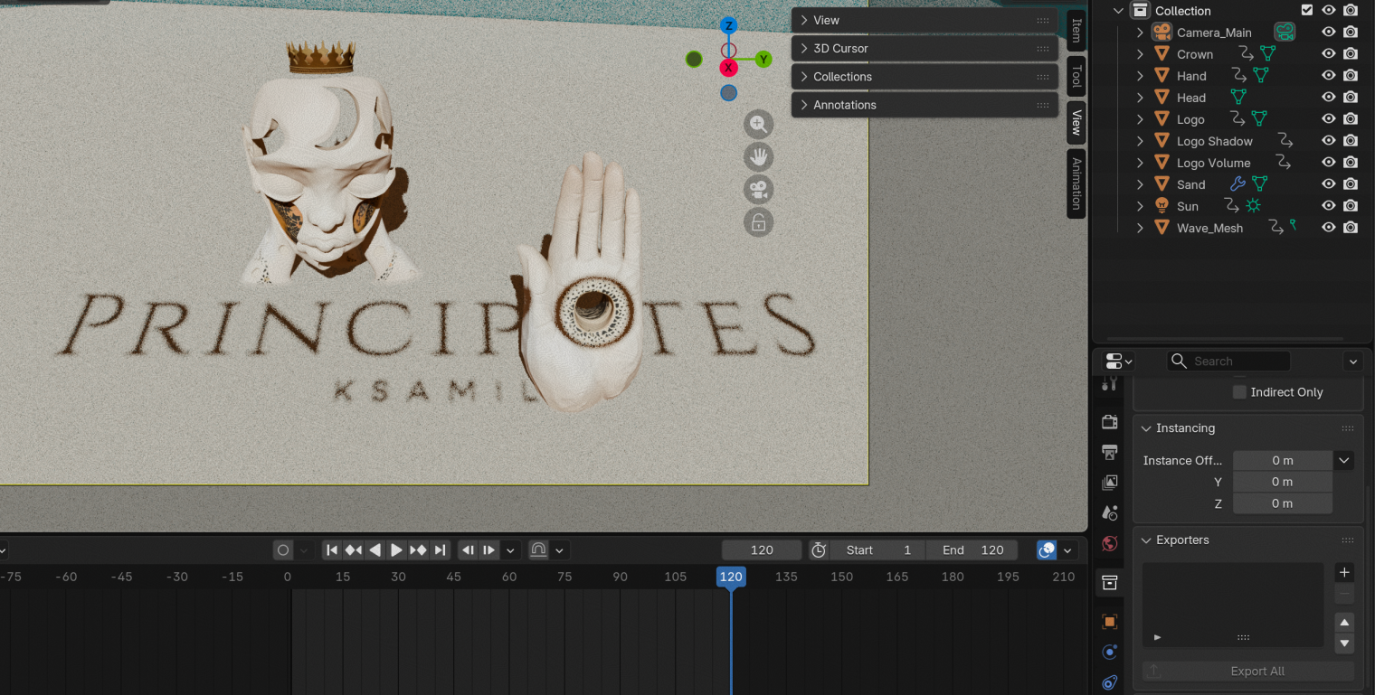
Custom 3D animation built in Blender for the website hero: an animated Ksamil beach scene designed to be the first thing a visitor sees. The motion brief was meditative and slow: Aman Hotels pacing, not advertising energy. This was the most technically isolated workstream, entirely outside Figma, and the one where the brand's physical context (the actual beach, the actual light) most directly informed the output.
Wireframes
13 pages across Day and Night modes: Homepage, Discover, Restaurant, Beach & Lounge, Wellness, Experiences, Suites, Gallery (Day), Homepage, Events & Nightlife, Gallery, Reserve Now (Night), plus unified Restaurant and Reservation pages. Desktop 1440px and mobile 390px for each. The reservation UX followed a Scorpios-inspired space-first flow: pick your beach spot on a map, then surface add-ons in a sidebar. Basket unified across both modes.
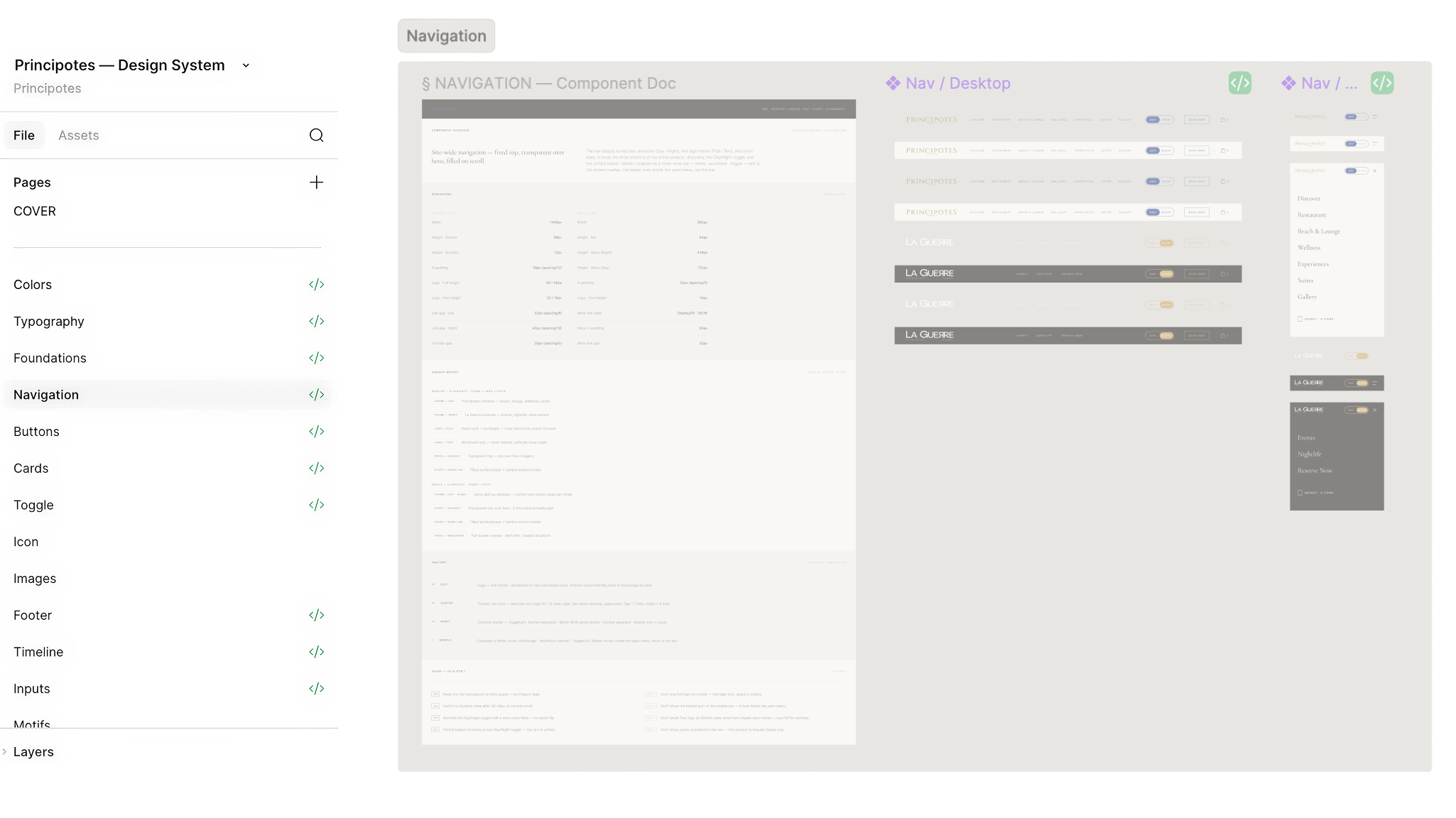
Design system
Full Figma design system built from scratch: token architecture (colors, spacing, radius, typography, 17 text styles), navigation components (14 variants across Day/Night × Desktop/Mobile × state), full card system (8 card types, each with Desktop and Mobile variants), button system, inputs, toggle, footer, timeline, motifs, and icon and image pages. Every component token-bound for automatic Day/Night swap. No hex values in components. Strictly semantic variables throughout.
Master designs & implementation
High-fidelity master designs for all 13 pages, desktop and mobile, across Day and Night modes. Handed off to developers with full token binding, component usage, and interaction notes. I then assisted implementation directly: reviewing Claude Code output, writing and fixing specific component code, QA-ing UI against designs, and resolving issues at the code level, not just flagging them across a handoff gap.
How I approached it
The fundamental challenge was sequencing. Every layer of the product depended on something beneath it: master designs couldn't be built without a design system; the design system couldn't be built without the token architecture; the token architecture had to express both brand identities simultaneously. Getting the order wrong would have created rework at every stage.
Tokens first, everything else second. Before touching any component, I established the full semantic token system: Day and Night color collections mapped to the same variable names, so any component built with semantic tokens would automatically resolve correctly in both modes. This decision, which felt slow at the time, is what made the Day/Night swap structurally sound rather than a surface-level trick.
Aesthetic references as constraints, not inspiration. The primary visual reference was Aman Hotels: full-screen, near-zero text above the fold, meditative pacing, no clutter. Scorpios Mykonos for the reservation UX. These were treated as hard constraints rather than mood board suggestions: any design decision that violated their logic was rejected, regardless of how good it looked in isolation.
Working in close collaboration with the General Manager. All scope decisions, aesthetic direction, and prioritisation were made together, directly. This proximity meant design and strategy were never separate activities: decisions moved fast, context was always shared, and the product stayed coherent throughout.
Key decisions
The Day/Night toggle as a structural commitment, not a feature
The Day/Night concept was the single most consequential decision in the project. It could have been implemented as two separate sites, or as a page-level theme toggle. Instead, it was built as a CSS variable swap at :root level: the same URL, the same DOM, the same basket state, the same reservation flow, with the entire visual identity switching via semantic token resolution. This meant every design decision (component architecture, token naming, navigation structure, copy) had to account for both modes from the start. There was no designing for one mode and adapting for the other.
No prices anywhere on the site
The reservation model is fully request-based: no payment at booking, confirmation by email within two hours. This was the client's decision, but it required a full rethink of the reservation UX. Without price anchoring, the conversion logic had to operate entirely through experience signals: imagery, copy, add-on presentation, and the sense of effortlessness in the booking flow. The Scorpios space-first model (pick your spot on a map, then add-ons surface in a sidebar) was the structural answer: the interaction communicates luxury before any commercial question is raised.
Removing gold borders from all cards
Early card designs across the system used gold accent borders as a luxury signal. They were removed after a systematic audit: borders at card level read as decorative trim, not structural hierarchy. They made the cards look cheaper, not more refined. The reference that settled the decision was the Wellness Card (the first card in the system built without borders), which immediately felt more editorial. It became the aesthetic anchor for the entire card system.
Treating motifs as architectural elements, not decorative stickers
The brand motif system (wave, meander, olive sprig, mosaic vine, azul flower) could have been applied as overlay decoration: placed on cards, headers, footers to add texture. Instead, they were designed as background architecture: large-scale, low-opacity structural elements that give pages depth without competing with content. The distinction sounds aesthetic but has a real layout consequence: architectural motifs are placed in the early layout stage, decorative stickers are added at the end. The former shapes the composition; the latter just fills it.
The design system
The DS was the most technically intensive workstream. Every component had to satisfy a constraint that doesn't exist in single-mode design systems: it had to work in both Day and Night mode without modification, by resolving semantic tokens correctly in each context. Any color applied as a hex value, anywhere in any component including doc chrome, would break the swap.
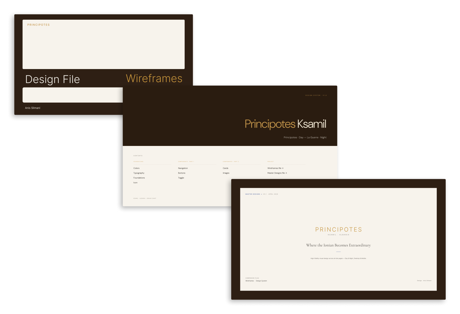
The system is structured around three files: Design System (components), Wireframes (structure and layout), and Master Designs (high-fidelity output). The DS file has dedicated pages for each component family, each with a standardised doc format: component overview, dimensions and variants, token specs, anatomy callouts, and Do/Don't guidelines.
Token architecture
Two color collections (Day, Night) mapped to identical semantic variable names. Spacing tokens, radius tokens, and 17 text styles. No raw values anywhere in the system.
Navigation
14 variants: Day/Night × Desktop/Mobile × Default/Scrolled/Menu Open states. Wordmark and text-only logo variants for both brands.
Card system
8 card types (Experience, Suite, Dish, Basket, Add-on, Gallery, Wellness, Event), each with Desktop and Mobile variants and complete token specs. Night-only Event card with 3 semantic states.
Buttons
4 variants × 5 sizes × 5 interaction states × Day/Night. Production copy. Do/Don't guidelines. No DM Sans. Cormorant Garamond display paired with Inter UI.
Inputs
Text, Textarea, Select, Checkbox: all 8 states per component (Default/Filled/Focus/Error × Day/Night). Focus ring at 1.5px accent stroke.
Motif system
5 motifs (wave, meander, olive sprig, mosaic vine, azul flower) remapped to semantic tokens. All treated as architectural background elements, not surface decoration.
Outcomes
The structural output is a system the development team can extend. New pages, new components, and new seasonal content can be added without rebuilding the token architecture or breaking the Day/Night swap. The DS is not documentation of what was built. It is the foundation for what comes next.
V2 is in active planning: implementing the full e-commerce reservation system, integrating SevenRooms for CRM and reservation management, Adyen as payment processor, and Syrve as POS, with Albanian fiscal receipt compliance (Drejtoria e Përgjithshme e Tatimeve) as the primary unresolved technical constraint. The complexity of this stack (POS + payment processor + CRM, across two brand modes with a unified basket) is the next design challenge.
AI as a production tool
Claude Code was active throughout implementation. Components were generated, reviewed, corrected, and iterated in real time against the design system specifications. With a two-person development team and 60+ components to ship, AI compressed the feedback loop between design intent and working code in ways that would not have been possible at this pace otherwise.
For a product designer working at full-stack scope, AI is not a convenience. It is a force multiplier on the one constraint that actually limits the work at this level: time. Being able to move between design review, code correction, and QA without a full handoff cycle is part of what let this project ship V1 at the quality it did.
This is not a workflow I adopted late. The designers who will matter most in the next few years are not the ones using AI to move faster on the same tasks. They are the ones using it to take on scope they could not have owned before.
Reflections
The most professionally useful thing I learned was the difference between designing within a product team and being the product team. When there is no PM, no creative director, and no senior designer above you, every decision (scope, sequencing, aesthetic direction, stakeholder communication) is a design decision. The quality of the output depends as much on which decisions you make in which order as on how well you execute any individual one.
The token architecture decision is the one I would point to as the highest-leverage technical call of the project. Spending two weeks establishing the semantic variable system before touching any component felt slow. In practice, it meant that every component built after that worked in both modes without intervention, and that the master designs could switch identities without a single manual colour override. The investment compounded across the entire project.
The hardest part was not design. It was maintaining aesthetic integrity as scope and ambition grew simultaneously. Luxury products are unusually unforgiving: one cheap-feeling decision (a card border, a font weight, a spacing inconsistency) erodes the entire register. Holding that standard consistently, across 149 component variants and 30 frames, required the same discipline as the individual design decisions.
"This was the first product I took from ground floor to shipping. The measure of it isn't the number of components or the number of pages. It's whether the venue's guests feel, from the first second on the site, that this place is worth flying to Albania for."